Keep reading
All updates More in this category
Built with farmers.
Shipped in weeks.
Fifteen minutes with Ari. Bring the thing you wish your software did, and he'll tell you if it's already built.
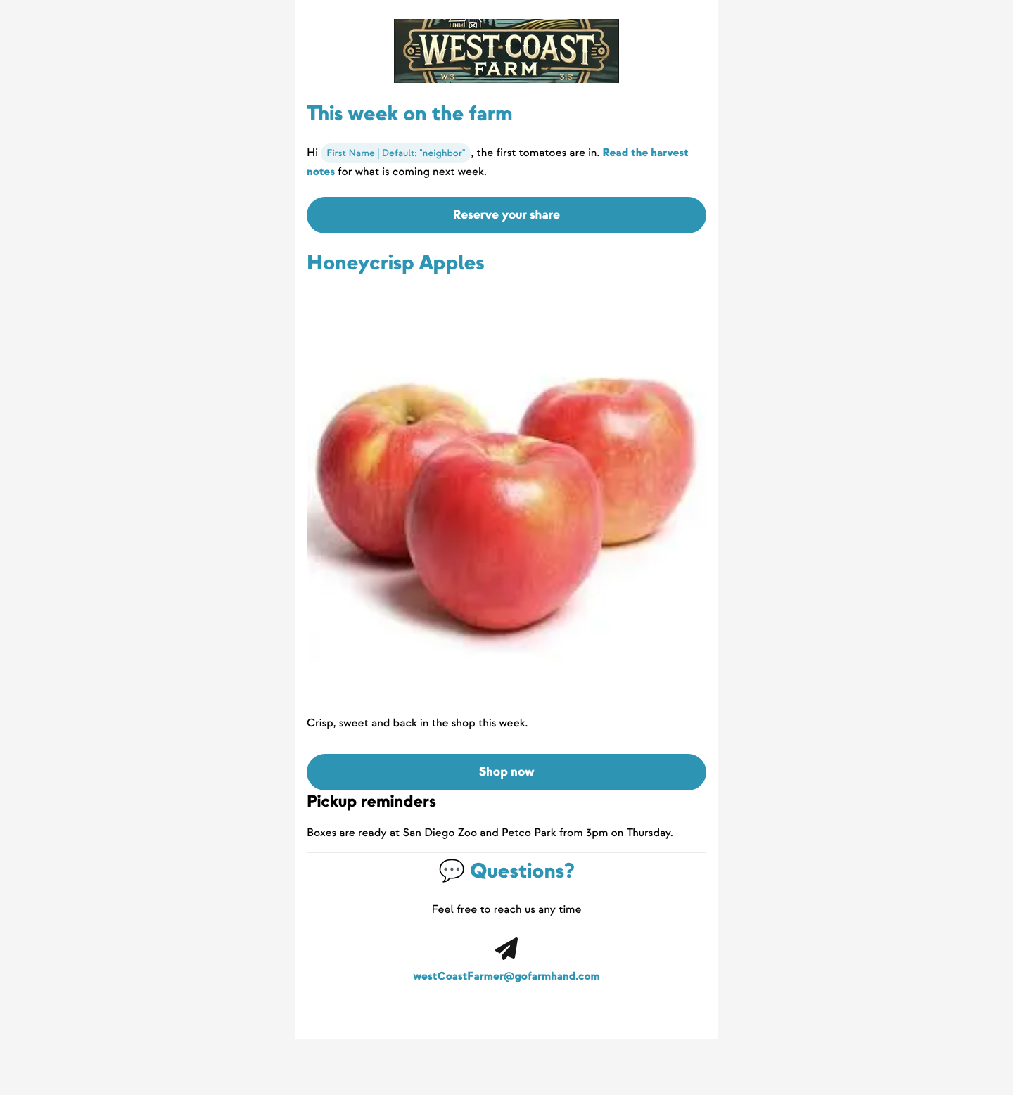
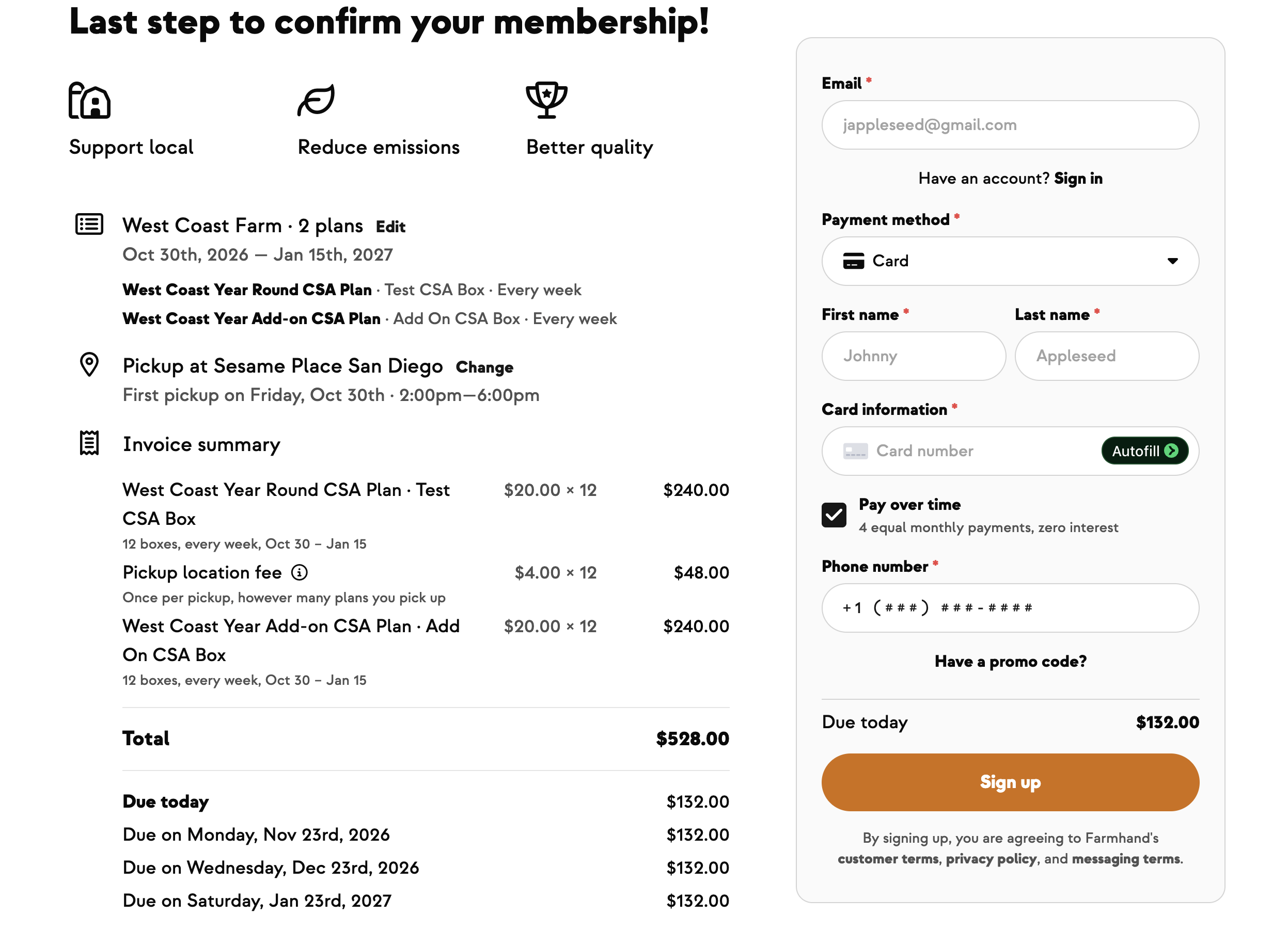
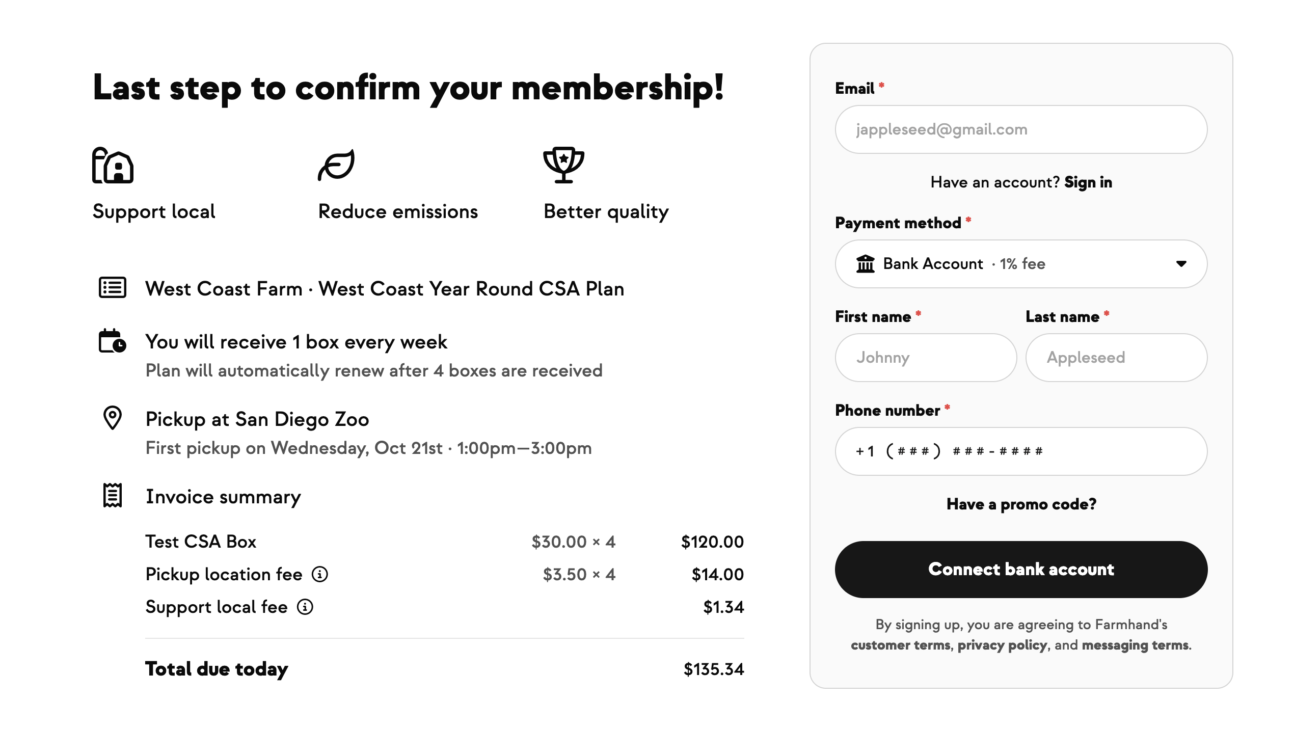
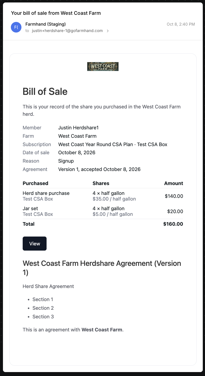
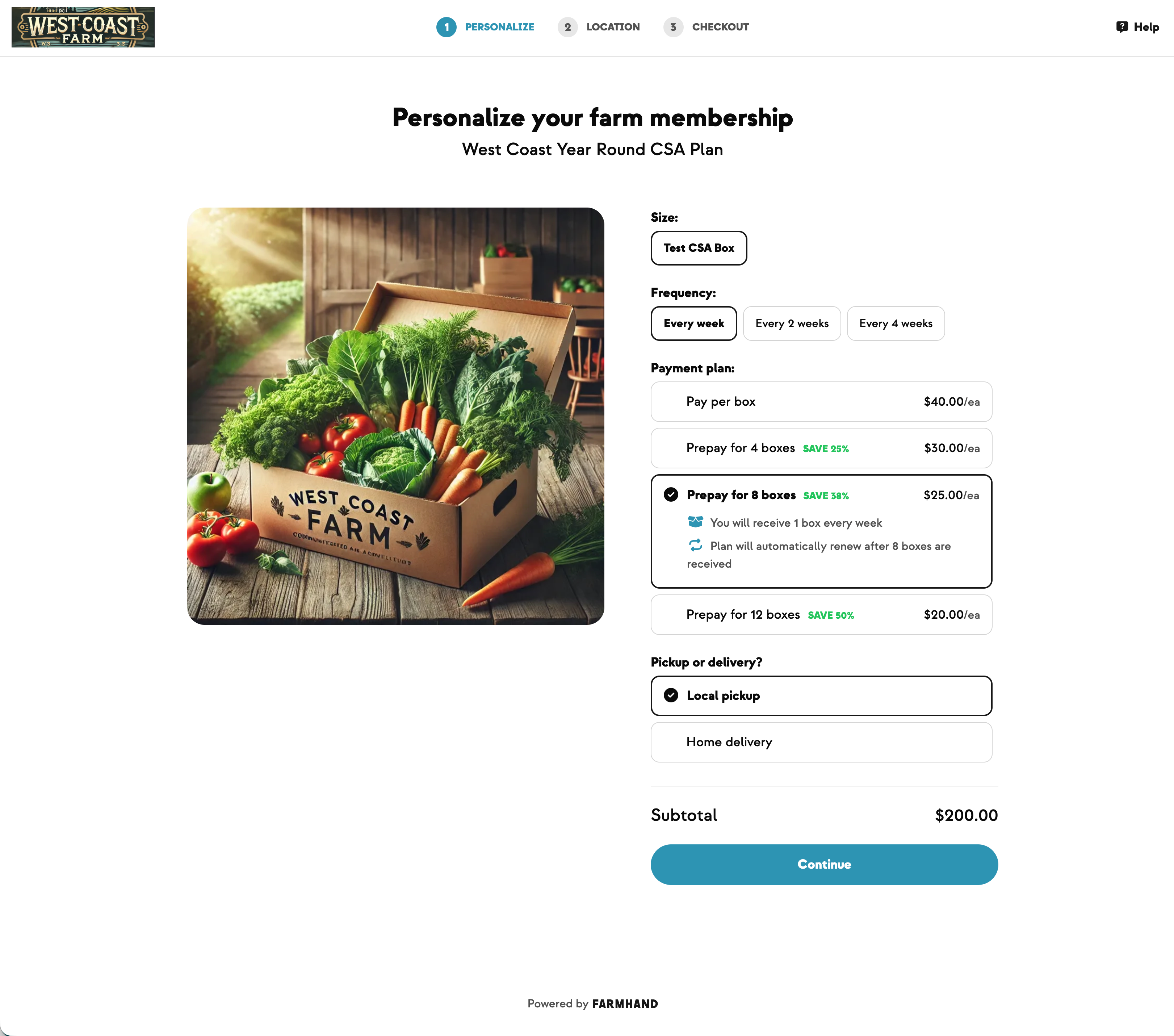
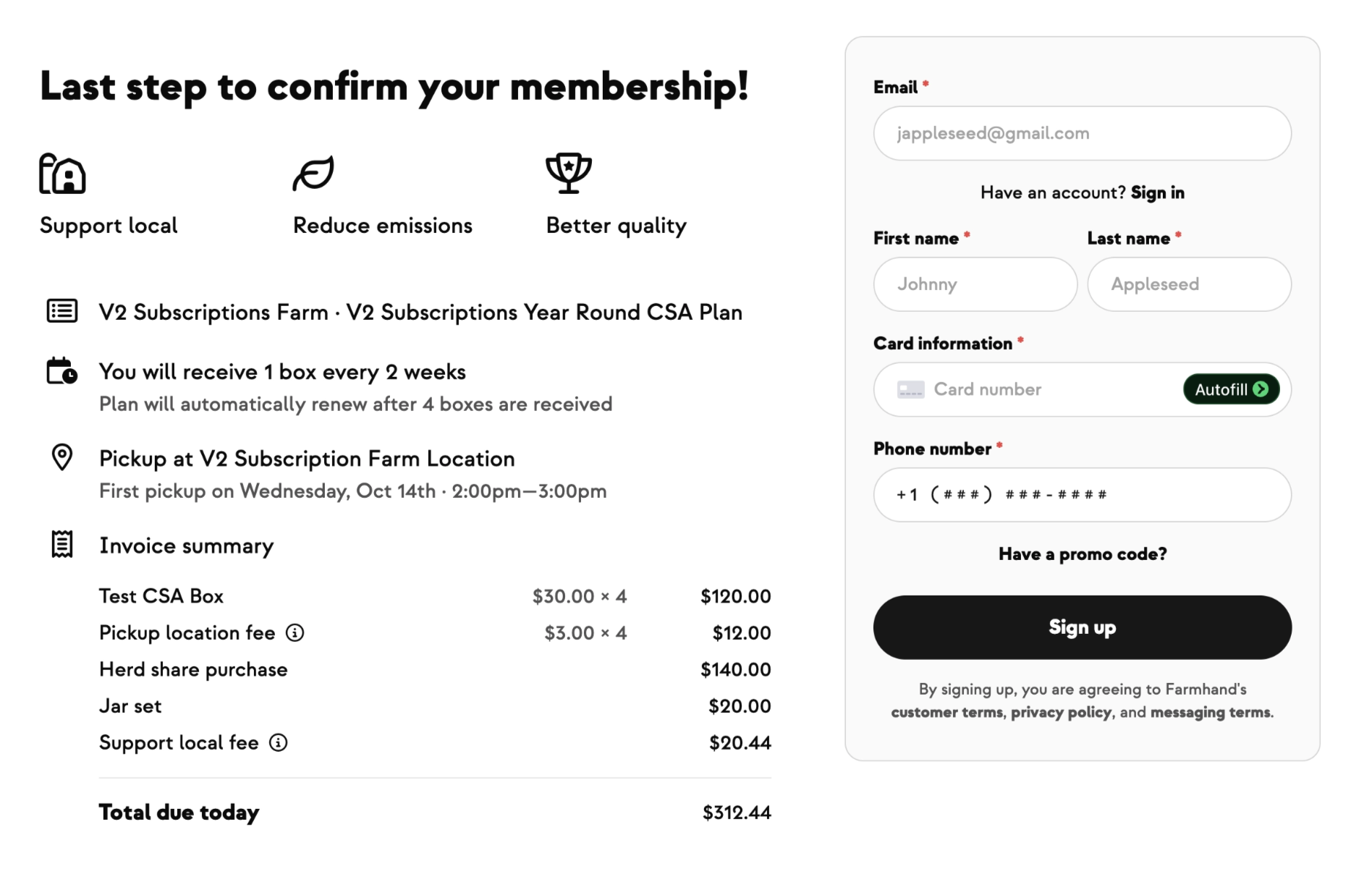
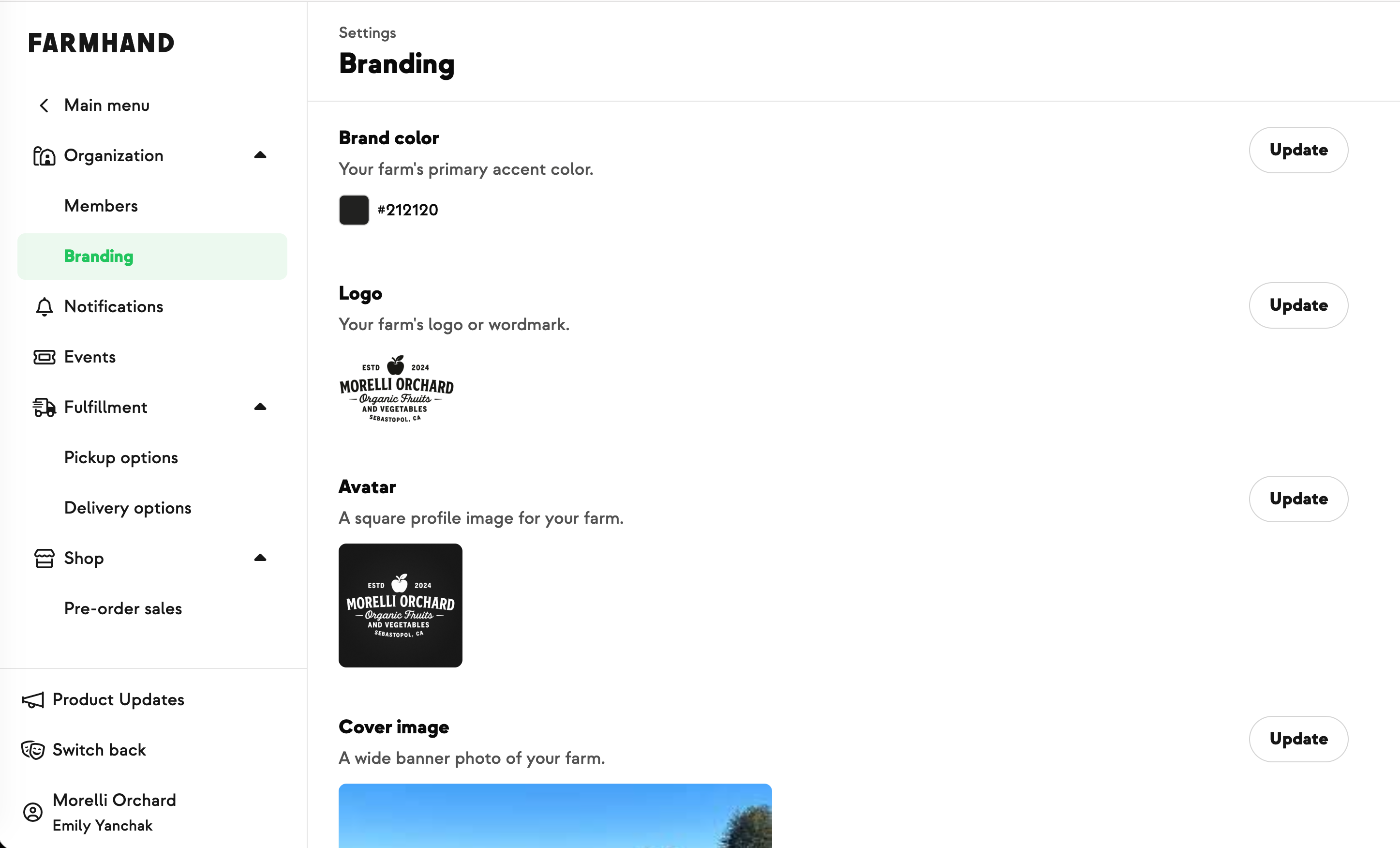
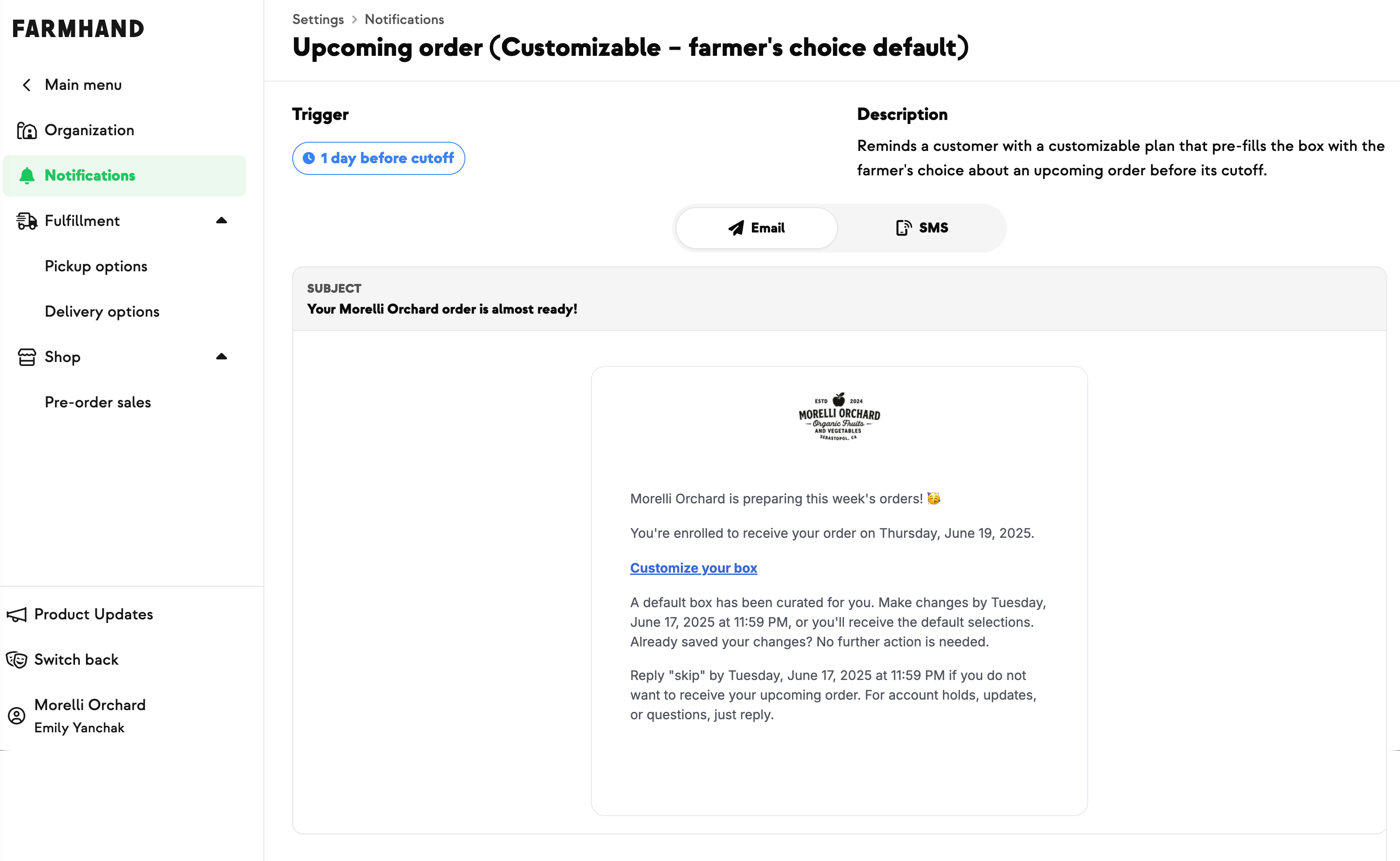
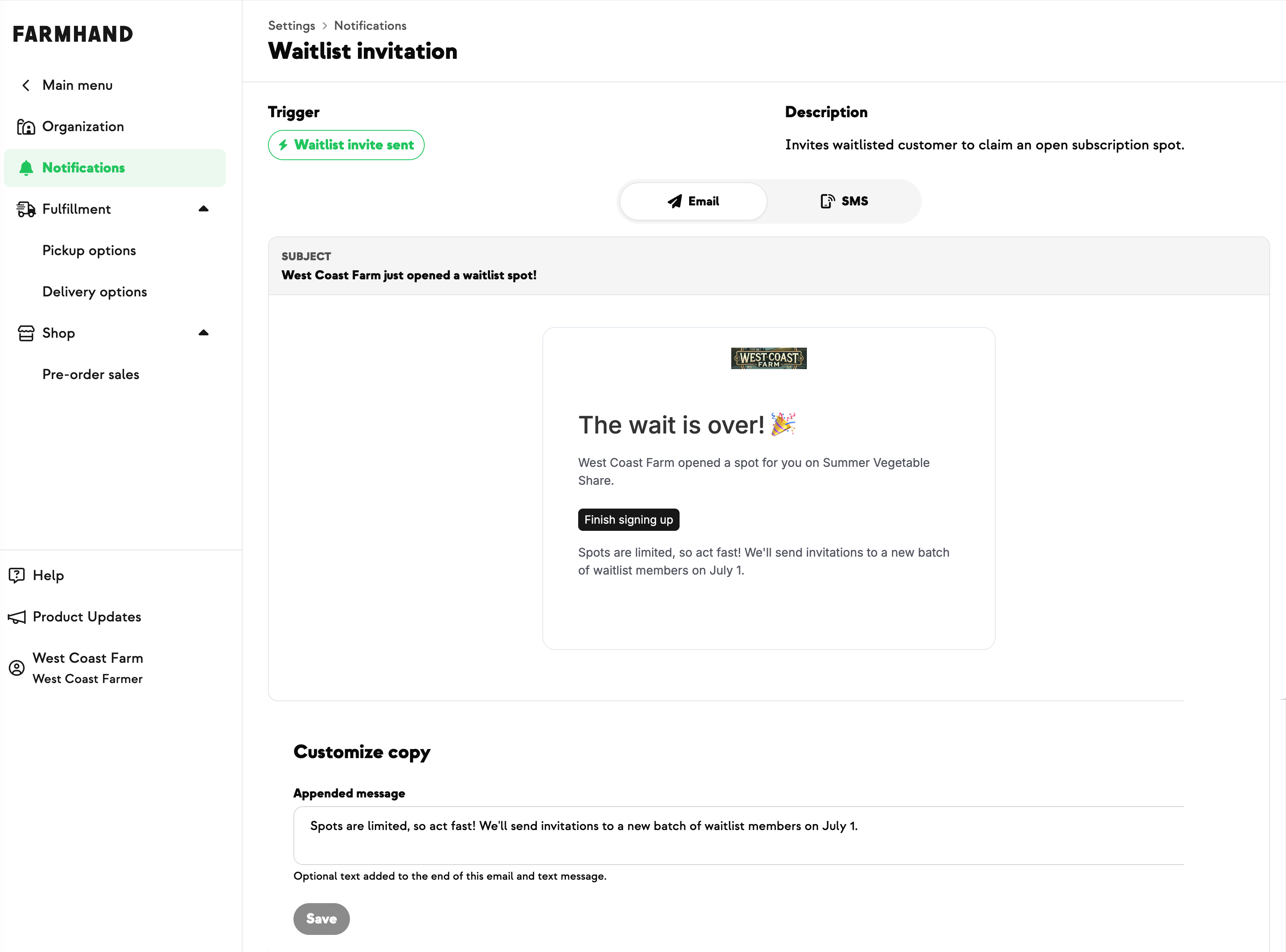
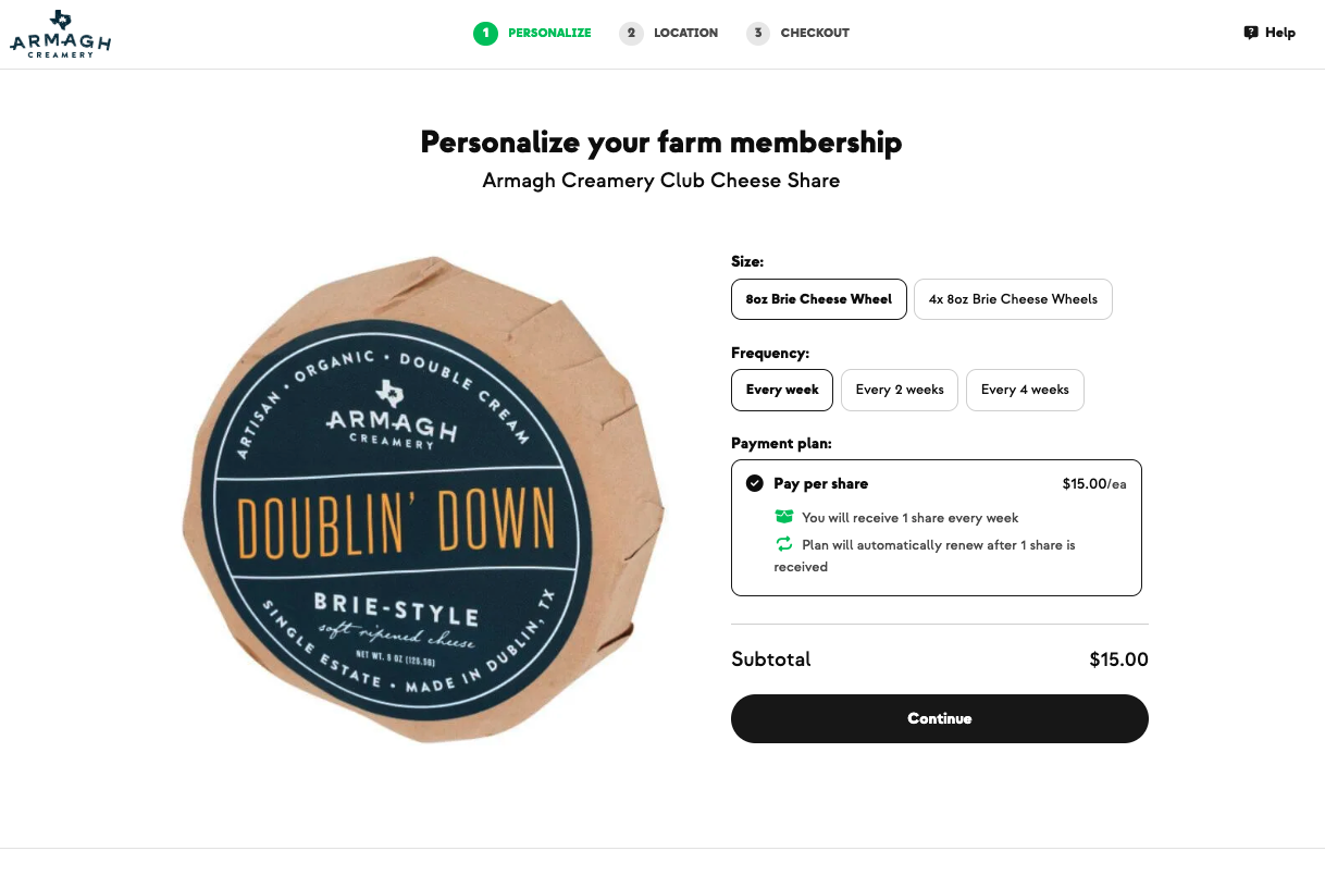
When your CSA signup pages took on your farm's brand color, they came with a few built-in smarts to keep everything readable, whatever color you chose. Now your campaign emails follow the same rules, so your color looks as good in a member's inbox as it does at signup.
Buttons darken just enough when they need to and always keep white text. Headings, links, and your contact details use a slightly deeper shade of your color, so they stand out clearly on a white email. Pick a pale sky blue or a soft sage, and your emails still read cleanly and look like you.
Dark brand colors look exactly as they did before, and if you've never set a brand color, nothing changes.
Built with Ellie at Providence Organic Farm, who wanted her farm to look like itself everywhere members see it, from signup to every email after.